
Tim Adams posted a link to his new tiwtter back ground design, and I think it's just wonderful!
It inspired me to update mine ( I had been using one of the default ones they have), so I sat down for an hour or so and really thought about how I could make my twitter page a bit more appealing to my followers.
Keep with the brand of course!
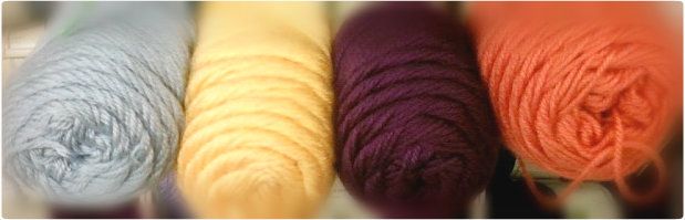
My favorite colors are yellow and blue, and so, they've become Lanee's Crochet's brand colors. I was lying awake one night thinking, 'I should have some kind of graphic to associate my shop with as well', but unfortunately, I'm the worst ever drawer of yarn balls or anything that is associated with crochet period.
I think it's best for some one like me to stick to geomtrical shapes for such things- and so, here we are!
I'm totally happy with how it turned out. I've tied in my shops' banner and font as well as added this new element to the mix, and it still looks pretty decent! (hell yes i'm patting myself on the back on this one- c'mon, you have to agree that it's pretty cool) =-P
I'm encouraging those of us who have a shop or studio some where as well as a twitter on which we share our specials, new products and help promote others to personalize the twitter!
It's delish and will let ppl know where they're at!
Follow me @laneescrochet

No comments:
Post a Comment
Share your response to this post.